Thursday, July 31, 2014

" and now for something completely different " ....

 
 every now and so often, i get the urge to break out of the natural wood/stained wood palette and stretch a little.  i have done it several times, like in the picture of the desk below that i made back in the late 80's ... lately too, i've been doing some pottery with bright colors and patterns, and when i had to make a piece for a guild of vermont furnituremakers show at the vermont statehouse, i thought,
why not ??  click the photos to enlarge them ...
 i started with some sketches, and a 30"slab of white oak that has 
been hanging around for a while now.  i have a 6' chunk left that would
make a nice small dining table
first sketch with a natural top and red edges
 
sam and i had recently been to the clark art museum to see david smith's circles, so there was that ...
and once i had the sketch/drawing, and the slab
 
the base just sort of designed itself
 being still a little unsure, i painted the bottom of the top first, as a test of the concept
i  made a 'pattern' on the cnc, which i used as a 'guide' while i hand painted the circle motif.  i raised it off the suurface with some carpet glides so i didn't have to worry about 'bleed' and got a round, yet handpainted looking circle.  the dark surround was a full strength coat of dark brown/black aniline dye that i painted, brushed out, and left to dry.  it was important to me to get some strong color, yet still see the grain of the wood through it when i was 'done'.
 
all in, all done, and in montpelier now .. the show opens saturday, and i will have more on that soon.

Saturday, July 26, 2014

fun with edvard

 well, kit had a visit from edvard last night while she was making a salad.  love the teeth ...
 click the photos to enlarge them

i'll be looking for one like this again now every time i cut a pepper.
a little more history on the original paintings below, from wikipedia

"The original German title given to the work by Munch is Der Schrei der Natur ("The Scream of Nature"). The Norwegian word skrik usually is translated as scream, but is cognate with the English shriek. Occasionally, the painting also has been called The Cry.
In his diary in an entry headed, Nice 22 January 1892, Munch described his inspiration for the image:
One evening I was walking along a path, the city was on one side and the fjord below. I felt tired and ill. I stopped and looked out over the fjord—the sun was setting, and the clouds turning blood red. I sensed a scream passing through nature; it seemed to me that I heard the scream. I painted this picture, painted the clouds as actual blood. The color shrieked. This became The Scream.[8]
This memory was later rendered by Munch as a poem, which he hand-painted onto the frame of the 1895 pastel version of the work:
I was walking along the road with two friends – the sun was setting – suddenly the sky turned blood red – I paused, feeling exhausted, and leaned on the fence – there was blood and tongues of fire above the blue-black fjord and the city – my friends walked on, and I stood there trembling with anxiety – and I sensed an infinite scream passing through nature.[9]  "

Wednesday, July 23, 2014

david smith at the clark

sam and i checked out the new david smith exhibit at the new clark art museum last week.  check out that first link for many images from the remodeled museum .. the clark has been closed for about 2 years and just reopened on  july 4th  .. sam and i went to the guggenheim exhibit back in 2006, which was a tour de force of the smith's incredible output of amazing steel work.  here's a link to images online from that show  he filled the whole main spiral and several side rooms .. an amazing show .. even the catalog was a whopper.  i've got it out again for a review and it's a great one ... the catalog is still available, but hang on to your checkbook ..

surprisingly, i was able to find this photo from our visit to the guggenheim in 2006
in my computer.  i think that is 'australia' behind us ... 
it was crazy crowded for a thursday morning at the clark, but we got to see what we went to see and it was all very inspirational
they are big
and they are colorful
and they are well thought out ... in the exhibit, they are set up exactly as 
mr smith had them set up in his meadow at bolton landing.
there were also a few other pieces with a circle theme
and a few of his large, interesting, 'spray over arranged objects'canvases.

they are all good in their own way ..

and the main collection was intact and only slightly rearranged.  above is the famous alma tadema designed steinway that took a lot of people a long time to create in 2005, 500,000 pianos after steinway made the original in 1887.
but the approach and the reflecting pools are quite striking ..

Thursday, July 17, 2014

another round dining table

trevors on the home stretch on this expanding wlanut dining table.  
it's another 60" round pedestal style table with leaves for expansion.
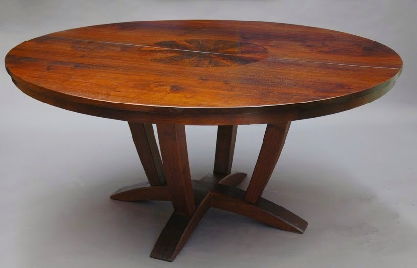
the clients placed the order while we were working on the mid century style table below
and the modifications to the design of the base we came up with together.
the model was helpful too ..
low down view, with the runners hidden by the apron
we used some fine walnut from our friends at irion lumber
cad drawing


Monday, July 14, 2014

a pop up tv cabinet

 
we sent a new 'pop up' tv cabinet off to california last week.  we've done a few of them over the years and we thought when we started out that it would be an exact copy, only slightly larger, of the piece below we made back in  2006 or so.  hardware above from horton brasses ... click the photo to enlarge them ...
as it turned out, while the designers (a famous california firm) were working on the project, the clients changed the main motif from 'country' to 'something more contemporary' , like 'mid century modern', which required a different finish. we sent it out 'ready to finish' and we'll all be interested to see what it looks like when it is installed later this week.
it's basically a plywood box with a decorative exterior composed of panels hung on it.
to keep the total height lower, we recessed the base of the lift into the base of the cabinet.
post and frame and panel construction throughout.
it's pretty wide at 68", so luckily the doors will only be opened to access 
and set up the audio/video components inside
home stretch
 the cabinet sits in front of an open stair railing and all sides and ends are visible.

Thursday, July 10, 2014

metal shop stuff

 sam's finished up a couple nice items in the metal shop this week.  above is a gate in process

and here it is, ready for paint ... love it!
 and we finished the reclaimed chestnut table top yesterday ..
 before the finish, above .. 'picture frame' style, similar to the 'basque style table we did back in january.
model below and a few other photos of the base in process at this link.
the model, in mdf and pencil .. 1/6th scale