Wednesday, January 30, 2013

an antique table repair


 it didn't take too long to go from the basket case above to the reenergized table below.  good for another 100 years if my clients can keep the movers away from it.  it was hard for us to imagine quite how it ended up in the shape above, but it looks good now.  we can't figure out exactly how old it is either, not being experts on early factory ?? furniture.  it did definitely have some obviously hand done joinery and a 'bricklaid'  veneered apron, which puts it on the early side, but it also ahd some factory like elements, including the little buttons over the screws holding the aprons on, some slotted brass machine made screws reinforcing the leg joints, yet the top veneer pattern had a hand done feeling to it.  i'd peg it early 20th century, english.  comments?  click the photos to enlarge them ...
 ta dahhhh .. striking piece with a decent, but probably not original shellac finish.
 the breaks in the stretcher were mostly on the long grain and after will stuck them back together with glue and masking tape, i routed in some 3/16ths" maple 'bars' over the repaired breaks to reinforce them.
 i also cleaned and replaced the 4 dowel joints where the stretcher joined the legs.  there were some earlier minor stretcher repairs so it wasn't the first tragedy that befell it ... i don't believe the previous mishaps were as serious as this one though.  will also replaced some broken off pieces on the leg top yesterday and repaired the area where the aprons joined in the bridle joint.  we swabbed on the hide glue today and wriggled the stretcher into place.  no clamps necessary except on the bridle joint.  (almost) good as new.

a small chest of drawers


willl delivered this little piece to shelburne yesterday.  right on lake champlain.  a beautiful house in a beautiful spot.  it's a smallish, 7 drawer chest, with sidehung dovetail drawers, felt on the drawer bottoms, and removable low dividers in each drawer.  i think the form is also called a 'lingerie cabinet' and this one will be located in the client's bathroom.  click the photos to enlarge them.
 
 the construction was straightforward.  a ply case with drawer runners routed into it, and solid wood sides, top, and face frame.  the back is a piece of 1/2" plywood, painted on the outside.
  
  standard issue, quartered white pine dovetailed drawers ..
walnut divider grids, with hardware selected by the designer of the piece, michelle holland, an interior designer we have often worked with in the past.


the finish was clear m.l. campbell magnamax lacquer (a nod to the possible moisture in the bath).  a sweet little piece.

Monday, January 28, 2013

a really old friend

now this piece is what you would call a REALLY old friend.  i actually made this cherry and ash piece, according to the client, in 1980, my first full year in the custom furniture business.  the client was a friend who started and owned a successful art gallery and custom framing business at the time.  the design of the doors is actually taken from one of his most successful frame designs.  originally, there were two shelves above it, but the second one was crowded out in the bar's most recent home by what i believe is a striking gunter korus oil.  click the photos to enlarge them.
i don't remember the origin of the carved drawer pull detail, but i remember it being a challenge to cut those faces out of the top frame board to make the grain continuos.
this view shows more clearly the finger jointed slate frame for the well cared for black slate, and the hand carved backsplash detail
drawer detail with funky dovetails ...
a view of the interior of the cabinet.  i actually remember making the jig to create the 'box corner' detail on the v shaped pieces.  i think the ends of the 'vs' slid into angled slots in the sides of the wine rack.
this piece is actually for sale.  the client is now in his late 70s and intends to downsize to a new home in the spring and he's editing his extensive holdings.  he told me last week he 'hasn;t had a drink in 27 years' and his 'daughters house is too small' so it is on the block at a VERY reasonable price.  way less than i would build it for again now.  if you are at all interested, please contact me at 802-867-5541 for details.
thanks! it's a great piece.  if i had a place for it, i would consider buying it myself !

two cherry side tables


here's a quick little project.  a little trickier than it looked at first, but happy in it's new home now.  the challenge was to make a pair of tables for either end of a couch in a 30 degree bump out in a client's home.  we made a quick, screwed together mockup below to check our angles and used that to formalize the final joinery.  click the photos to enlarge them ...
 after placing the mockup at the clients home, we decided to make the tables an inch and a half wider across the front and added an inch and a half along the angled sides.
these two views show the challenges of the joinery more clearly.  the right angle joints were made with traditional mortise and tenons on the apron.  the pattern for the tops, with joinery shown on both sides to make a pair, is in the background of the photo above, with the grain orientation cut plan shown.
the angled aprons were joined with loose tenons cut parallel to the faces of the legs ... the tapering of the legs was the last thing before gluing them up and all legs 'read' an inch and a half at the top tapered 7/8th" at the bottom.  clampng was a trick, and in fact, the angles were just fitted snugly, glued, pushed together and left to set overnight on the table saw in the picture below.
i sent this photo to the client and he questioned whether we actually had a pair of tables, or two the same,  i had to go look in the finish room to confirm that they were, indeed, a pair.  you figure it out.
relaxing in their new home ... all is good ...

Sunday, January 20, 2013

the spaces we make

we make furniture, one piece at a time, it's true, but, we also sometime make spaces, often intimate and personal spaces, that can have a deep meaning for us and for the clients we work with.  i visited the space in the photo above yesterday, to discuss some new work in an upstairs office, and was struck by the peacefulness and beauty of it.  the client was the designer and she has an impeccable eye.  we applaud her taste in custom furniture.  the two pieces we made in the photo, the large kas tv cabinet in the background, (back when big tvs were still big), and the custom pool table in the foreground, both look great over 10 years later.  both were challenges on a lot of levels, but looking at them now i remember the challenges as both fun and considerable.  click the photos to enlarge them ...
this piece was for another special client who was, to say the least, a collector.  he pointed me to set of random shelves with items arranged lineally and told us to, as i recall'  'make them make sense'.  the individual shelves are lit, the objects are all in original finishes, and while almost all were antiques, there were some most arresting, contemporary, maria martinez pieces in the mix.  the duck decoys are all 'top shelf' and represent just a tiny part of his 100 plus piece collection displayed throughout other areas of the house.  it was also my first experience of seeing diebenkorns, milton averys, stuart davises, and georgia o'keefe paintings in a private home.
and in preparation for a recovery from a hip transplant, we created this round and tapered tv stand in a corner of the bedroom.  this was one of the first flat screen tvs i had ever seen and he encouraged me to stretch a little outside the box on the design.


the next four images, including the greene and greene style desk and chair above, are for a husband and wife who are long time (25 years) clients, and for whom we have done many, many pieces.  there's generally a discussion or two, a sketch or two, and then a negotiation or two, and than we do it .. in the end, the pieces always seem to feel just right for their spaces.
table and chairs, 1987 
coffee table, 1989 ... the challenge here was to not obscure the amazing carpet.  i saw it this holiday season and the rug is as vibrant and arresting as ever.  we took our main design cue from the 'ram's head' detail in the carpet design ..
 
loyal readers have seen this one before, but it's from the same house as the three photos above.
in this kitchen we took our cue for the stools from the verticals on the island face, using a frank lloyd wright inspired stool design and a cherry counter top with a walnut and curly maple stripe down the center.
and in the next room, we built an entire greene and green inspired dining room with a custom sideboard and mirror, some wall sconces, an expanding table with 8 chairs, a hanging lantern and a corner cupboard that you can see reflected in the mirror.  this work was all done in 2003, and the client liked it so much, we did another very similar version of this room in 2008,  for another house he built in greenwich, ct.  the detailing of the sideboard construction for that dining room was our most popular blog post ever.
 
in 2003, we also created this double chest in quartered sycamore, along with a bed , side tables and a reclaimed chestnut tv piece.
this cherry and burl dining room set was another commission that created an intimate dining room on long island.
and, working with the manager at the equinox hotel in manchester a few years back, we designed and fabricated this lighted corner display case where the hotel features its events. sometimes a little used, awkward corner space can become highlight of the area.
 
and this piece was another 'ambiance piece' for a local hotel, the dorset inn, where it lived for almost 20 years until the inn changed hands recently and it went off to the former owner's home, one of, i believe, the only pieces she retained when the inn was sold.

     and sometimes, folks just want to have fun .... why not have your own custom home bar.  we would have liked to make the stools too, but i think that would have been a stretch after the bar project.  one of the most rewarding things we get to do in our work is to work with clients to produce their visions, and then visit those spaces later, after the fact, to see how they use and enjoy them ...

are we interior designers?  not really, and certainly not all the time, but occasionally we get to start from nothing and create a warm and personal space for our clients with our designs, and that is a most rewarding experience.

below is an intimate dining table in a park avenue apartment that the clients helped me to design and they tell me still that they use it 'every day'  ..

more on interior design and a brief discussion of the influential book 'a pattern language' by christopher alexander at this link


"At the core... is the idea that people should design for themselves their own houses, streets and communities. This idea... comes simply from the observation that most of the wonderful places of the world were not made by architects but by the people". —Christopher Alexander, A Pattern Language, front bookflap

another good one i'm reading right now is 'at home..a short history of private life' by bill bryson.

my own office at work
a custom home office, danby, vt
entry hall, manchester, vt


Friday, January 18, 2013

another claro walnut slab coffee table

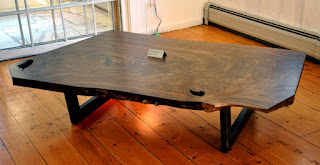
we finished another in our series of claro walnut coffee tables this week.  it was a perfect slab for a coffee table and the rainbow leg from sam's metal shop go perfectly with the color of the wood.  click the photos to enlarge them
 
the raw slab
 
1.5 x 3" welded steel tubing

above is the bottom of the slab,  below are a few other coffee tables from the past ... 
 from the dorset artists show last summer
 the last coffee table slab i have on hand at the moment, though i have three new ones arriving sometime in the next two weeks
 2009?